

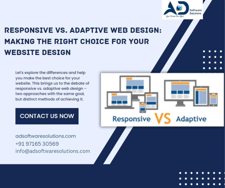
In the dynamic world of web design, staying on top of trends is essential to delivering the best user experience on all platforms. As more and more people use a variety of devices to access the internet, it's crucial to focus on making sure your website looks and works perfectly on every platform. This takes us to the discussion of responsive vs. adaptive web design, two strategies with similar goals but different ways to get there. Let's examine the variations so that you may select the option that is appropriate for your website.
Responsive Web Design
Responsive web design is a technique that focuses on creating a single version of a website that adapts to various screen sizes and resolutions. This is achieved through the use of flexible grids and CSS media queries. In responsive design, the content remains the same, but the layout and design elements adjust to fit the screen size.
Benefits of Responsive Design:
1. Ease of Maintenance: With a single codebase, updates and changes can be made efficiently, reducing the time and effort needed for maintenance.
2. Consistent Branding: Since content is the same across devices, branding and messaging remain consistent, providing a unified user experience.
3. Future-Proofing: As new devices and screen sizes emerge, a responsive design is more likely to adapt without requiring major adjustments.
Factors to Consider with Responsive Design:
1. Performance: Sometimes, responsive designs can load unnecessary assets on smaller devices, affecting page load times.
2. Limited Device Optimization: Content might not be optimized for specific devices, potentially leading to a suboptimal user experience.
Adaptive Web Design
Adaptive web design takes a different approach by creating multiple layouts and design variations for different screen sizes. When a user accesses the website, the server detects the device's screen size and delivers the appropriate layout.
Pros of Adaptive Design:
1. Tailored Experience: With specific layouts for different devices, adaptive design can provide a more tailored and optimized user experience.
2. Performance: Since assets are optimized for specific devices, page load times can be faster compared to responsive designs.
3. Device-Specific Features: Adaptive design allows for the integration of device-specific features and capabilities.
Cons of Adaptive Design:
1. Complex Maintenance: Multiple layouts require more effort to maintain and update, potentially leading to increased maintenance costs.
2. Less Future-Proof: As new devices with varying screen sizes emerge, adapting the existing layouts can be challenging and time-consuming.
Both responsive and adaptive web design have their merits, and the choice between them should align with your website's goals and user expectations. Ultimately, the key is to create a seamless experience across all devices, ensuring your audience can access and engage with your content without any hurdles. As technology continues to evolve, staying informed about the latest design trends and techniques will help you make the best decisions for your website's success.
Remember, whether you choose responsive or adaptive design, the ultimate goal remains the same: delivering an exceptional user experience that keeps visitors coming back for more.